You may think that slapping a pop-up on the home page of your website is enough to capture a visitor’s attention.
You’d be wrong.
In most cases, it does the opposite. Even if you think your discount or newsletter is undeniably worthwhile, an ill-timed pop-up will make a website visitor search for the “X” before they even read your offer.
With that being said, you have two options in regards to your marketing pop-ups.
You can either use pop-ups regardless of how annoying they can be to visitors or create effective pop-ups that are timed and targeted so visitors actually like them.
We’ll show you how to do the latter. ;)

The smart way to make effective website pop-ups
When it comes to website pop-ups, most marketers only think of their offer or campaign.
“What discount do we want to offer?”
“What product do we want to promote?”
“How can we get more email subscriptions?”
This company-first mentality may be the reason your pop-ups aren’t as effective as they could be.
Instead of thinking of your asset first, think of the customer first.
And yes, we know just about every piece of business advice starts with “put the customer first,” but here’s how to practically keep that in mind for website pop-ups.
Think,
- “Who do I want to see this pop-up?”
- “What do I want my customer to be doing when they see this pop-up?”
- “What benefit does this pop-up provide my customer at this point in their shopping experience?”
Keep these customer-first questions in mind as we go through ways to make your website pop-ups more effective.
5 ways to make your website pop-ups more effective
Let’s look at ways to make your pop-ups less annoying, and to be honest, most of the time it boils down to timing.

1. Focus on the timing of your website pop-ups
Timing matters when creating and optimising your website pop-ups. Timing in a few different aspects actually:
- Timing within campaign launch
- Timing of actual pop-up triggers
Pop-ups should be a part of your initial strategy when you have a new marketing campaign.
You should implement website pop-ups at the beginning and duration of your campaign. If you overlook using website pop-ups at the beginning of your campaign, when your sale is almost over, you may be tempted to display pop-ups to any and every visitor since you weren’t strategic from the beginning.
That’s a big no-no.
Now, for when to functionally trigger your pop-ups, that depends on those questions we asked ourselves earlier about our customers.
You want to allow the visitor to spend some time on your page before hitting them with the first pop-up.
If they land on a blog post page, you can trigger your pop-up to display after 15 seconds for example. This allows the reader some time to read your content.
And, if they leave this page before 15 seconds, you know that they weren’t very interested in that piece of content, so your pop-up could have been in vain if triggered sooner.
You can trigger a discount pop-up once a visitor has been browsing a specific “Shop” page for 8-10 seconds. This gives the visitor time to make sure they’re on their desired page, and then notice a relevant offer.
You can trigger a shipping-related pop-up when the website visitor has added items to their shopping cart.
You can trigger a newsletter subscription pop-up when a website visitor has clicked on multiple pages or has spent over 15 seconds on one page.
By strategically timing your pop-ups, you're making sure they are more helpful than disrupting.
2. Position pop-ups wisely, don’t fully interrupt the experience
Next on the totem pole of what makes pop-ups ineffective is when they disturb the online shopping experience.
Overall, the positioning of your pop-up also influences how they are perceived. If a pop-up takes up the whole screen, you have paused the website visitor’s session and this could be a negative for the user.
If it's hard to find the exit button on your pop-up, this may lead the website visitor to leave your page totally instead of trying to figure out how to exit the pop-up you just interrupted them with.
Additionally, you’ll need to position your pop-up for mobile and desktop, don’t ignore one or the other. If you ignore modifying your pop-up position on mobile for example, when a visitor sees it, they may think it is quite pointless since they can’t read it completely anyway.
So remember, pop-ups usually disturb the customer when:
- They cover the whole screen
- They are hard to exit
- They are partially cut off
Our tips for positioning pop-ups:
- Anchor your pop up to the bottom right corner, on the side near the scroll bar, or as a banner so it is in a familiar location
- Don’t automatically trigger a full-screen pop-up
- Make sure to have an ‘X’ somewhere near the top right corner of your pop-up for easy exiting
- Check that your pop-up fits on mobile and desktop screens
3. Make your website pop-up easy to find again
Occasionally a website visitor may click to exit a pop-up before they even can register what it was about.
That’s why it’s a good idea to minimise the pop-up once a visitor exits it. So, when they realize later “Hmm what was that one discount about I saw in that pop-up early?” they can easily click the minimised icon.
Remember, that it is very important that the minimised view of your pop-up does not cover any text on your website page. If it does, this leads to a bad experience for the customer when no matter what they do, they can’t remove the pesky pop-up blocking their view.
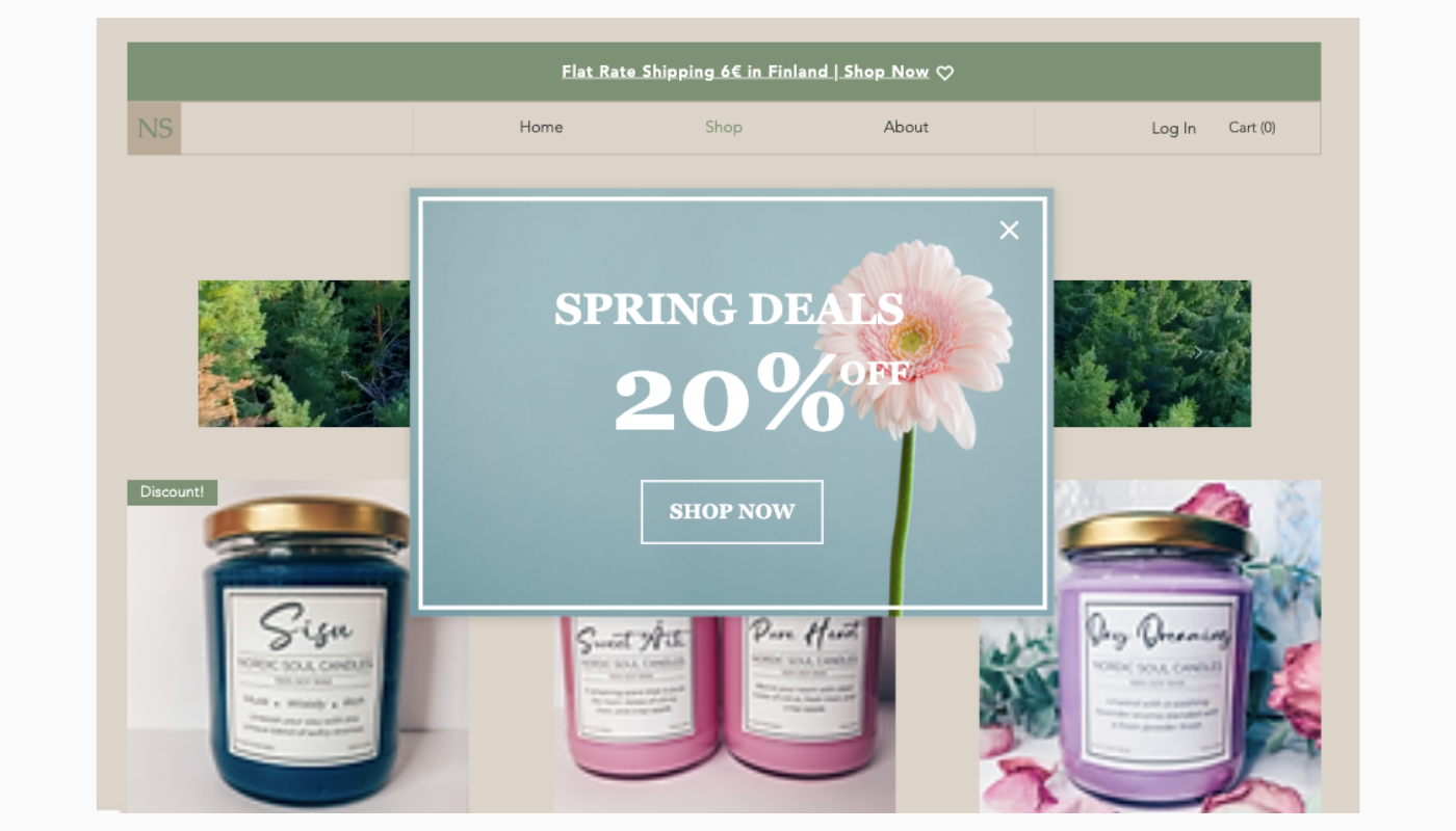
4. Design on-brand website pop-ups
Does anyone else recall what spammy website pop-ups looked like in the 90s? You know, alarming hues of red and yellow popping out at you and basically screaming “scam”?
Well, when you design your website pop-ups with your brand colours in mind, you avoid this haunting reference… no offence to red and yellow brand colours though!
Some pop-up builders make it easy to pick the exact colour hex code that you use on your website and transfer it to your pop-ups.
.png?width=1400&name=website%20pop-ups%20(1).png)
It is important for your pop-ups to be eye-catching. Utilizing a font generator to make a font that is tailored to your brand's colours can make your pop-ups look more attractive and professional. Coordinating your brand colours and fonts can be a great way to make your pop-ups more engaging and inviting.
Want to attract even more customers with your website pop-up designs?
Consider using videos in your pop-ups. You can use short marketing videos that spark booth inspiration and action from the viewer.
If you include shoppable videos in your pop-ups, a user can directly click on a product they like from the video and be redirected to a specific product page.
5. Write a direct & compelling CTA
Your words are powerful. If you’re going to use a pop-up to catch the visitor’s attention, you need to make sure what you are offering and what you want the visitor to do is crystal clear.
If you’re pop-up’s goal is to take the visitor to a specific selection of products, you’ll want to provide a bold “shop now,” “see the collection,” or “see more” button that directly transports the visitor.
There’s nothing worse than seeing a pop-up with an offer that might interest you as a customer, but not knowing how to locate that offer on the website.
Adding a button that directs the customer directly to the offer’s page is one way to make the customer journey smooth and increase the chance of a conversion.
.png?width=1400&name=website%20pop-ups%20(2).png)
On the flip side, if your marketing pop-up advertises a discount code to checkout, encourage the website visitor to copy and paste the code at checkout.
With this being said, make sure the customer is able to manually click and copy the code.
If your pop-up’s goal is to get an email sign-up, then you’ll want to create a slightly more persuasive CTA.
A discount on their first purchase is usually a good incentive for visitors to submit their email address to your list. However, you can still make your lead capture pop-ups effective without having to dish out discounts.
Monthly inspiration, guides, tips, exclusive member discounts, or product launch information are attractive benefits you can offer your visitor in exchange for their email.
Here are some quick tips on how to make a compelling CTA for your website pop-ups:
- Create a sense of urgency (for example, “offer expires in 5 hours”)
- Use bold adjectives like “ultimate,” “pain-free,” “epic,” “free,” ”proven”
- Appeal to customer emotions that reflect wants, inadequacies, inspiration, security, success
More inspiration for effective website pop-ups
Now that you know what goes into a pop-up to make it more effective rather than annoying, it’s time to get inspiration for designing one.
Check out our blog post on 6 Pop-up Template Examples, to find the perfect starting point for more effective website pop-ups for your business.