Finding the balance between using pop-ups effectively and trying to avoid annoying your visitors can sometimes be challenging. We know that pop-ups can frustrate visitors but at the same time, they’re great tools for marketers to convert inbound leads and capture more emails.
When you’re using them correctly, pop-ups can actually increase the time visitors spend on your website and help you improve your lead capture and conversion rate. But how can you do it without annoying your visitors? How can you make your pop-ups work both for you AND your visitors?

It all depends on how you execute them and manage to turn annoyance into something positive and captivating. Take a look at some of our best practice tips on how to do it:
1) Target your pop-ups
There are different reasons for your website visitors to visit your site. According to their needs and the stage in their buyer’s journey, they’re expecting to see content that’s relevant to them.
To keep them motivated, make sure your pop-ups offer content that adds value to your visitors. Seeing a pop-up that’s completely irrelevant easily feels like spam, and is highly unlikely to turn your visitor into lead.
Targeting your pop-ups makes them feel more personal and relevant to the visitors, and can encourage them to give their contact information, and thus improve your website conversions.
Use your visitors’ browsing data to show them pop-up content that’s right and relevant to them at the right time. Trigger your pop-ups based on for example:
- What page your visitor is on
- Where your visitors are on your page
- Where they came from: previous page, campaign URL, traffic source
- Time spent on page
- The number of sessions on your website
First-time visitors who are reading your blog appreciate a newsletter sign up pop-up if it’s triggered at the right time and doesn’t interrupt them reading your content.
People who are considering different options are happy to see a pop-up offering your guide on a topic they need to educate themselves on.
You could also target your pop-ups to visitors from your referral sources. When doing this make sure your pop-ups are relevant to people landing on your site via paid ads or social media by matching your pop-up visuals, CTAs and messaging to your campaigns.
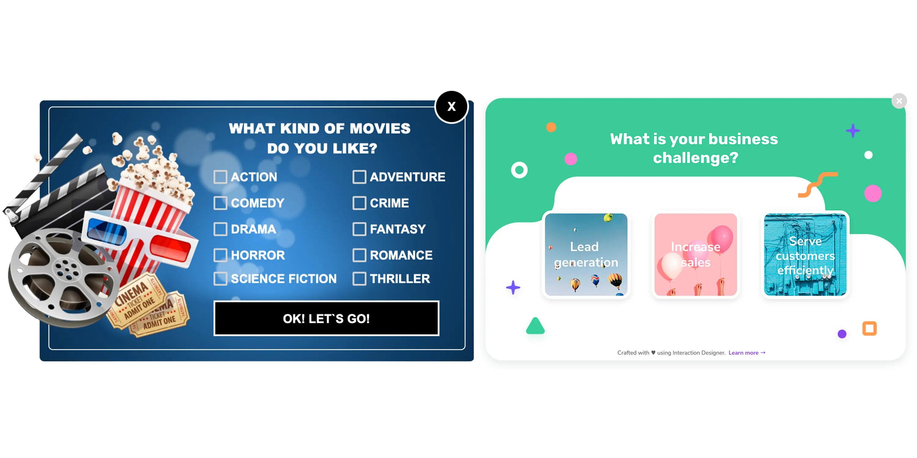
2) Make it fun
Turning your lead capture forms into games and other interactive content can make them more fun and engaging for your visitors compared to traditional pop-ups.
Using quizzes, questionnaires, games or other content that requires active participation can make pop-ups feel less annoying and help you increase conversions. Giving your visitors game-like incentives, such as points, badges, and rewards increases their motivation to part with their data.
By providing interactive content you’re also able to collect more information about your visitors than with static forms, and thus learn more about their needs, preferences and current status.
All in all, interactive forms are so well received that they can generate 4X more leads than static forms. It’s definitely worth trying fun interactive content like games with your pop-ups.
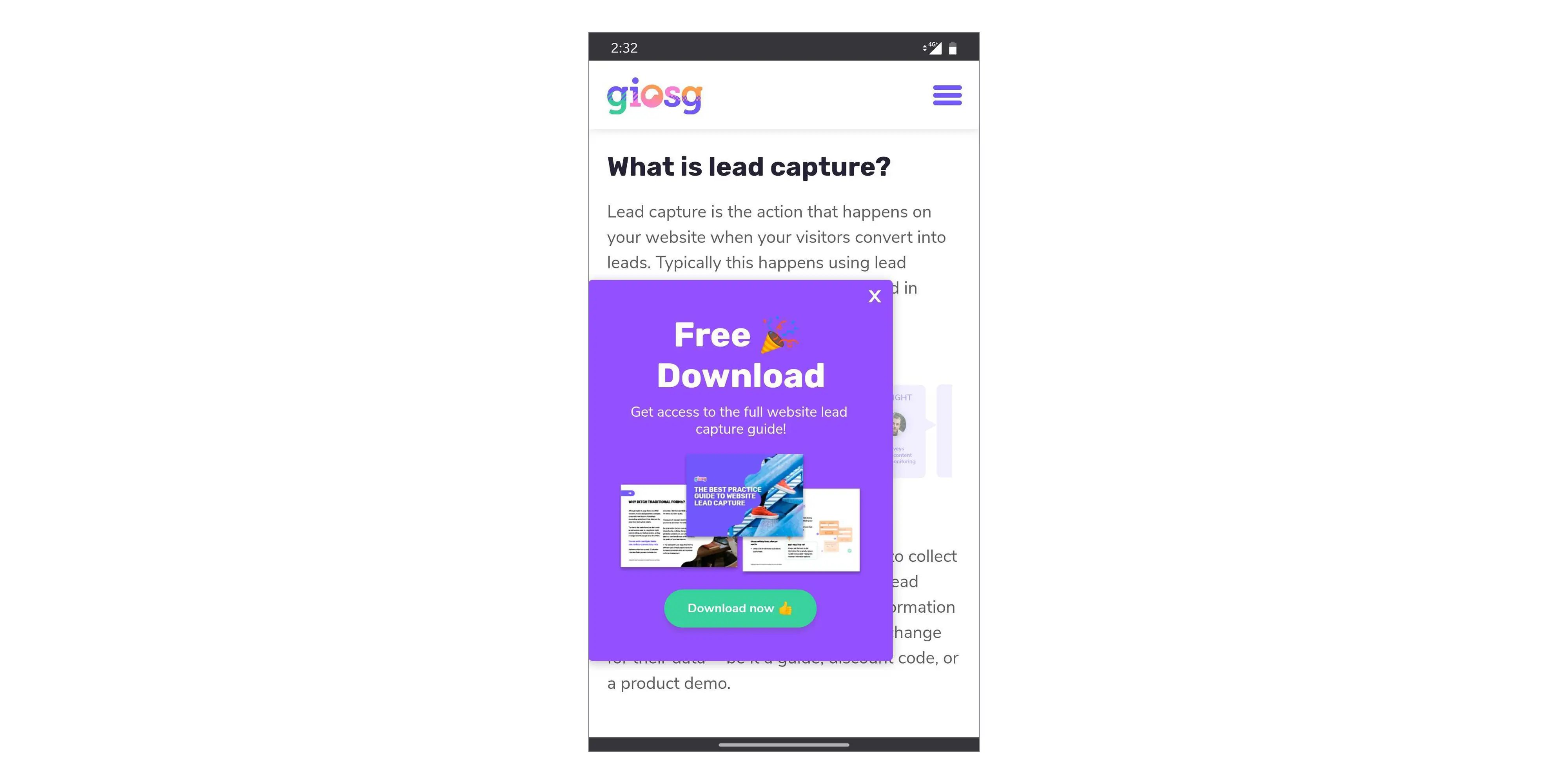
3) Optimise for mobile
Like any website feature, pop-ups should be optimised for mobile usage.
Nothing is more irritating than a pop-up on a mobile device expanding part of the information outside the screen. Even worse if it’s the X used to close the pop-up that’s appearing off-screen.
To avoid this from happening and to create a pleasant mobile user experience, optimise your pop-ups for different sizes of device screens and ensure it’s not intrusive to visitors .
Don’t forget to pay attention to download time, avoid heavy images that can make downloading significantly slower.
Ensure that your text on the screen is readable, and on the other hand, that visitors are able to easily enter their text to the pop-up form.
In an ideal situation, users are able to see your pop-up at a glance without needing to scroll. This requires keeping the number of fields so low that the whole pop-up fits to the screen.
To avoid risking your search results, keep in mind that according to Google mobile search, acceptable pop-ups use a reasonable amount of screen space and are easily dismissible.
This makes designing a separate pop up for your mobile users all the more important vs making a responsive pop-up that just scales the pop-up according to screen size.
Statistics show that optimising your pop-ups for mobile usage is definitely worth it as mobile devices account for more than 50% of the worldwide website traffic today.
4) Make exiting easy
To keep your users happy, always include the possibility to exit the pop-up. There’s no point in forcing visitors to fill in a form if they are not interested in it. You’ll just risk them leaving your website.
Make closing the pop-up easy by placing the X in the top right corner or by making it possible to close it by clicking outside the pop-up. This way, your visitors will be able to move on to other content on your site without feeling being stuck with your form.
Creating a smooth exit experience can make your users less annoyed when they see your pop-up the next time. You might even get them to fill in their details that time.
5) Don’t over-do it
While targeting your pop-ups and providing relevant content is key in creating a nice user experience, keeping the number of pop-ups shown on your site reasonable is at least as important.
It’s never a good idea to show several pop-ups per page, it will only confuse your visitors who won’t know what you’re actually asking them to do.
Nor is it a good idea to overload your visitors by showing several pop-ups during one session. Only show one pop-up per particular visitor after you have ensured that they have spent enough time on your website.
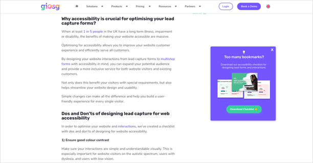
6) Don’t interrupt your readers
Pop-ups don’t need to appear in the middle of the page covering the content and interrupting your readers.
Instead, you can place them on the side of the page like we do, which makes them more approachable, and gives the readers the freedom to choose when they are ready to enter their information.
However, if you decide to place your pop-up in the middle of the text, pay attention to timing. The perfect time to display a lead capture pop-up depends on how engaged your visitors are with your content.
By analysing how much time your visitors spend on your pages on average, you can adjust the pop-up to show at about 50-60% of the average time on page, often recommended as best practice.
Your visitors will appreciate your efforts if you’re able to make a pop-up something that adds to the experience, not takes away.
7) Don’t ask too many details
Pop-ups are usually used for converting top of the funnel leads. They are a great way of offering your lead magnets or newsletter subscription to collect visitor information.
To avoid losing prospects, keep your pop-up forms simple, don’t ask too many details to make downloading or subscribing as quick and smooth as possible. The visitor’s name and email address will be enough.
If you’re looking to qualify your leads further and need more detailed information, think about using other tools like lead generation bots or live chat.
If you want to learn more about high-converting lead capture tactics, download and read our guide where we share more of our best practice lead capture tips.