Web accessibility is about ensuring everyone and anyone, regardless of disability can seamlessly interact and navigate online. And as more services move online, the focus on making websites and applications accessible to all has become increasingly important. 
Back in 2016, the EU introduced a directive on web accessibility for all public sector bodies. This directive sets a specific standard for website and mobile app accessibility and warrants that websites must be made “perceivable, operable, understandable and robust”.
If you're working in the public sector, you'll have come across this recently as the deadline for making sure legacy websites meet directive standards came to a close September 23rd.
Although the directive is specifically for the public organisations, accessibility should be taken into account by all businesses especially by software providers, like us, that work closely with public operators.
At giosg, we work hard to optimise our products and services inclusivity and user-friendliness. Watch our video about how we have developed the accessibility of our software.
Why accessibility is crucial for optimising your lead capture forms?
When at least 1 in 5 people in the UK have a long term illness, impairment or disability, the benefits of making your website accessible are massive.
Optimising for accessibility allows you to improve your website customer experience and efficiently serve all customers.
By designing your website interactions from lead capture forms to multistep forms with accessibility in mind, you can expand your potential audience and provide a more inclusive service for both website visitors and existing customers.
Not only does this benefit your visitors with special requirements, but also helps streamline your website design and usability.
Simple changes can make all the difference and help you build a user-friendly experience for every single visitor.
Dos and Don’ts of designing lead capture for web accessibility
In order to optimise your website and interactions, we’ve created a checklist with dos and don’ts of designing for website accessibility.
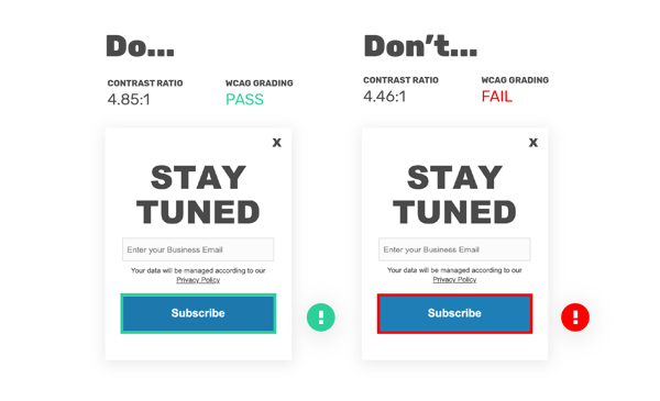
1) Ensure good colour contrast
Make sure your interactions are simple and understandable visually. This is especially important for website visitors on the autistic spectrum, users with dyslexia, and users with low vision.
Optimise your interactions by using good contrasts, calm colours and readable font sizes. Avoid using low colour contrasts, similar colours on top of each other, overcrowding content and small font sizes.
The differences can be very very subtle, as seen in the example below. These two examples have a small difference in colour contrast, but only one passes the Web Content Accessibility Guidelines (WCAG Grading) for colour ratio.
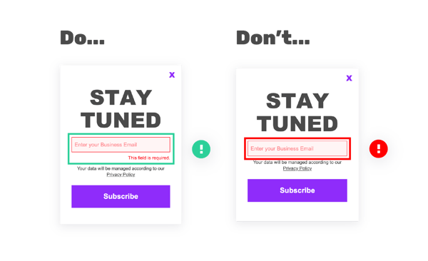
2) Combine colour, text and shapes
Always use a combination of colour, text and shape to convey your message. For example, if the visitor fails to fill in a required part of your form don't just show them, tell them. Combine colour and text to convey what the visitor has forgotten to do.
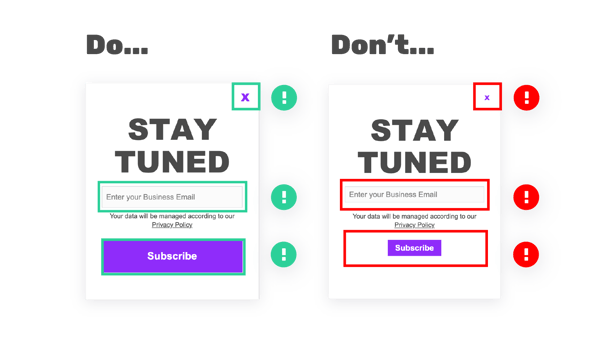
3) Create easily clickable buttons
Ensure that all your buttons are large enough, so they are easy for the visitor to click. Make sure you don’t require too much precision by making your clickable elements too small and difficult to click on.
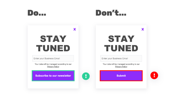
4) Provide clear Call-To-Actions
A strong and clear Call-To-Action is key for conversions, but also very important when designing for accessibility.
Make sure your CTA buttons are understandable, concise but also descriptive. This is crucial for designing for website visitors of screen readers and visitors on the autistic spectrum.
Avoid vague and unpredictable words like “Click here” or “Submit”. Instead describe what will happen once the visitor clicks on the button, think of actionable words like “Subscribe to our newsletter”, “Contact Us” or “Download whitepaper”.
Designing lead capture forms for screen readers
A screen reader is software that helps people with severe visual impairments interact online. This is done by naming and labeling your form fields and interactive elements clearly.
In giosg Interaction Designer, there are two sections that are designed for preparing your interactive elements for screen reader accessibility.
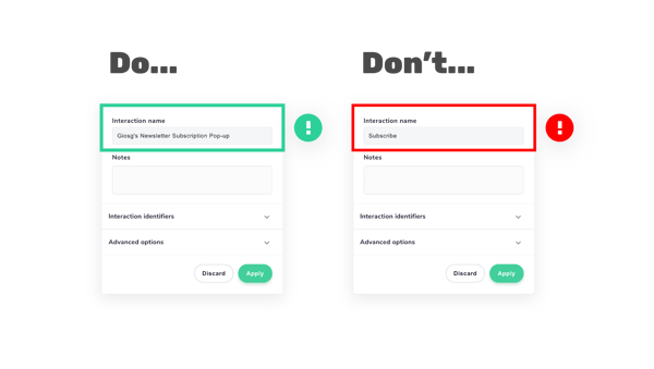
5) Use descriptive names for your interactions
Whether it's a lead capture form, pop-up or bot, make sure to name your interactions in a logical and descriptive way. This will enable the visitor to understand what they are being presented with.
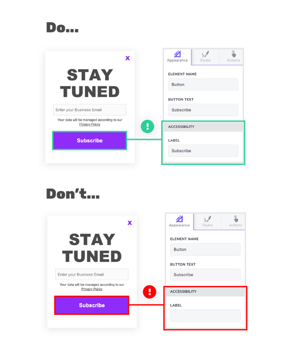
6) Use the accessibility section
The separate accessibility section in giosg Interaction Designer, allows users to correctly label their elements and form fields. The label should be used to describe the function of the element.
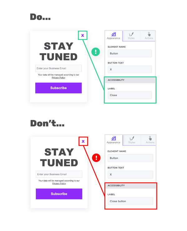
7) Always provide a close button
Always provide visitors with the option to close the interaction. Your close button should be visible on every single view of your interactions or multi step forms.
Screen reader technology will recognise the type of element and read the “Label”. So when labeling, the word “close” will suffice, as the system is able to recognise that this element is a button and will read it as “close button”.
8) Design for keyboard use
Finally, when designing for screen reader visitors in mind, never force mouse or screen use. Build your interactive elements and forms for keyboard use, so that the visitor can use their Tab key to navigate to different elements.
This means elements such as buttons, form fields, checkboxes, close buttons etc. are highlighted when the visitor uses their Tab key.

Want to learn more about optimising your lead forms? Read our lead capture guide to get tips and best practice tactics for better converting your website leads.