When it comes to eCommerce, each piece of content has a shared goal: to propel potential customers towards a deeper interaction with your business. The idea is that this will lead to conversion, by directing the customer to the company’s products or services with an elegant and effective call-to-action.
The customer journey following your content needs to deliver the reader the call-to-action efficiently and appropriately, otherwise, it’s just entertainment for its own sake. This is true of most retail sectors, whether a merchant or a direct-to-consumer distribution model and of many other areas.
With that said, make sure to proceed with caution, as customers can be wary of overselling eCommerce ads and promotions – the most effective calls-to-action have a degree of subtlety and ingenuity about them. Let’s look at ten of the best.
What is a call-to-action?
A call-to-action (CTA) is a clickable button in an email newsletter or on a website that is obviously what the customer has to click on to go to the next stage of the interaction. This might be a simple button or a pop-up feature that leads the customer for example to the product information or the purchase stage. In many instances, CTAs can direct the customer directly to the checkout.
Without a CTA, the customer might not think to take their interest to the next level, so the CTA has to be prominent and unmistakable. If it’s not, you face the possibility of having confused and unengaged customers. They won’t stick around for long.
Think of them like customers in a store struggling to find and purchase, for example, men’s trousers. Why are they struggling? It might be because there’s no signage to show them what to do and where to go. And be sure of this: befuddled trouser-hunters will take their custom elsewhere.
To maximize the effectiveness of your call to action, you must make sure that you are targeting the right audience with your CTA. For example, if you have a product based in Australia, you will want to ensure that you reach out to an Australian-based audience.
It’s important to understand that a CTA is not always about securing a sale immediately. Instead, it might simply invite the customer to get more information about, say, a phone number app for business. In this case, a ‘Find Out More’ action button would do the trick.
The key thing with a CTA is that it requires (and entices) the customer to demonstrate intent to engage further with the business, and it’s showing them how to do it. You can use a social media management tool to have more control over using a call to action on your Instagram, TikTok, Twitter, or Facebook accounts.
How to phrase your call-to-action?
Action verbs are certainly a good start. However, the exact phrasing of a CTA will depend a lot on what part of the sales funnel the customer is at when they encounter it. Let’s say they’re looking for a whiteboard app.
If they’re top of the funnel then they’re probably just looking for more whiteboard product information. A ‘Buy Now’ button will be a little premature here and may well scare customers off. So a ‘Click for More Details’ CTA would be a wiser choice here.
If they're in the middle of the funnel, then they’re in a position where they’re more likely to want to commit to adding the best whiteboard app to their cart. So, an ‘Add to Cart’ button would be perfectly appropriate here.
If they’re at the bottom of the funnel, then you can go all out and look to close the deal with a ‘Checkout’ button.
One final point – a CTA can’t do all the heavy lifting by itself. It can usually only be effective because the content leading up to it has put the customer in the right frame of mind. So a good CTA doesn’t exist by itself, nor can it boost sales by itself. It’s a culmination of what’s gone before.
Returning to the trousers shop example – you can have all of the greatest signage in the world, but if the store entrance is cluttered or otherwise unappealing, those signs will all be for nothing. So, CTAs have to have the groundwork.
Let’s see some great call-to-action examples.
1. Fresh language
You want people to subscribe to your newsletter. You could just have a button saying ‘Subscribe to Newsletter’. Sure, why not? It’s clear and people know what they’re going to get. It’s also a bit dull.
Household finance whizz Tiffany Aleche wants us to sign up for tips and regular nuggets of financial wisdom. However, she eschews the usual language, in favor of enticing us to sign up for some ‘goodies’.
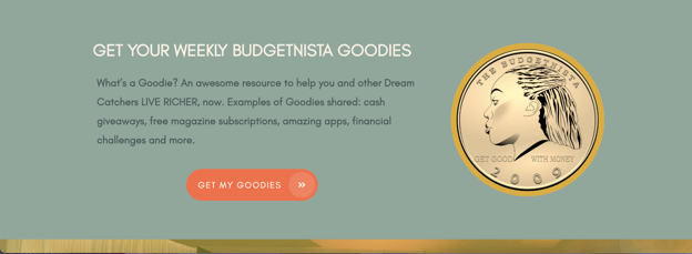
Screenshot sourced from the Budgetnista.
Who doesn’t like goodies? It’s a very effective CTA because it’s engaging and has the bonus of chiming well with the informal brand identity of the website and the business. And a nice contrasting colour scheme has been used too.
2. Unscary
People love the chance to try before they buy. This is why Netflix’s exhortation to ‘Join Free for a Month’ works really well as a CTA. Sometimes prospective customers can find it a bit off-putting to have to commit to something. The trouble with CTAs is that you never quite know for sure where you’re going to end up once you’ve clicked on one.
This one is nice and friendly and offers no reason why you wouldn’t want to click. By orienting the CTA around a free trial instead of the fully paid product in its digital marketing campaigns, Netflix can boost its overall ROI and conversion rates.
3. Killer phrase
As mentioned above, the CTA doesn’t exist in a vacuum. It needs framing. The customer needs to be enticed. Dialpad, a company that provides a host of communication functions such as phone services for small businesses, does this well with this example.
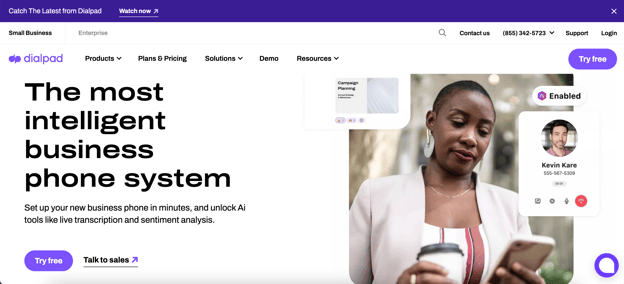
Source: Dialpad.
What’s one of the primary benefits of having a cloud-based business phone system? It makes remote working much easier. The simple and very enticing result is that staff can work from anywhere. With that selling point clearly established, all one needs is a clear CTA. In this case, it’s even more of a great prospect, as it says ‘Try free’. Great! I’m in.
4. Dynamic
Sometimes, you just want to get moving. You’re interested. Where’s the ignition? Don’t bother me with details on pricing strategies etc right now.
This is where Square’s example of a CTA below really hits the spot. ‘Headline - ‘The POS system that’s easy to set up and use’. CTA under - ‘Get Started’. Boom. Let’s go.
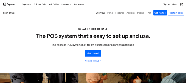
Screenshot sourced from SquareUp
5. Use of a power word
Holiday cottage company VRBO uses a simple bold headline above the CTA. The headline, ‘find your place for together’ does the work here.
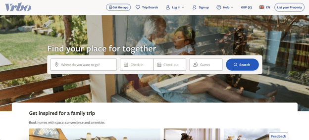
Screenshot sourced from VRBO.
Getting away from it all to a wonderful cabin or lodge or whatever is not just about escaping the everyday. It’s about finding a space for loved ones to be together. This is why the slightly awkward phrase ‘Find your place for together’ actually has such power.
Being together is what it’s all about. Once you’ve got that set down in words and imagery, a simple, bold ‘Search’ CTA has had most of its work done for it.
6. Fitting wording
Panthera is a conservation charity dedicated to protecting the world’s populations of big cats. Where the site visitor is invited to support the charity, there is a great, strong image of a group of lions lit by an African sun, with the phrase ‘Join Our Pride’ in bold at the top. The CTA at the bottom is a button with simply ‘Join’.
This is a terrific example of using language that’s appropriate to the subject, as well as one of the best weapons in the charity’s armoury - the striking imagery it has at its disposal. With these setting the action up, the CTA itself needs only to be minimal but unequivocal.
7. Pouring it on
Grey Goose provides a good example of how to build up to the buy CTA. Its martini cocktail recipe page is full of sensational-looking concoctions (a great example of ‘shoppertainment’), and by the end of it, you’re wanting nothing more than to know where you can get hold of a bottle of the strong stuff so you can start creating cocktails. This is offered as a very welcome ‘Buy Vodka Online’ button at the bottom. That’s a compelling CTA.
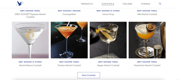
Screenshot sourced from Grey Goose
8. No nonsense
My Perfect Resume is a good example of a website setting out what it does, then offering the user a simple CTA, a no-frills invitation to take the business up on its offer.
It explains what makes its resumes effective, including the way it works in keywords and emphasises best aspects of the applicant, as well as outlining its template offering. It finishes with a subheading ‘Prove You’re the Perfect Candidate’, which is quite compelling. The CTA is then three words - ‘Build My Resume’. That’s what the visitor wants.
Straightforward and to the point. Just as a resume should be, in fact.
9. Lay it out
Nerd Fitness, a ‘fun place for nerds to learn about health and fitness, chat about gaming and comics, and live better lives’, tells you exactly what you’ll get when you ask for more information so that you’re not signing up for anything you’re not prepared for.
Under the headline ‘Get Your Nerd Fitness Starter Kit’ it lists what you’ll get, including how to conduct your first workout today, without a gym. Great wording on the CTA button - ‘LEVEL UP!’
It’s informative, effective and quite charming. It seems friendly and reassuring, which is crucial to people who are perhaps nervous about taking their first steps on the road to fitness.
10. Excitement
Sometimes a CTA works because it just promises a bit of excitement or entertainment. Take GiftRocket, a company that makes sending presents easy (and downright fun sounding).
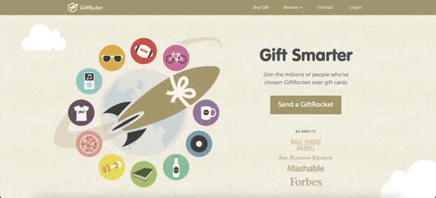
Screenshot sourced from GiftRocket
Send a GiftRocket? Wow - so much more of a buzz than ‘send a present'. It’s this kind of imaginative and energising wording that the future of retail is built upon. Do you want your product to stand out? Get that wording pumping.
Call-to-action!
Now you’ve got everything you need to craft your own CTA. The line between being too direct and too subtle can be difficult to tread, but if you take these lessons going forward, you’ll be making your own effective CTAs and converting customers in no time.